ASN Design System Light
version 1.00
General Styling
Colors
Define ALL colors which are used in the project. Choose clear descriptive names and try to keep the amount manageable.
Primary Colors
Primary colors are the most frequently displayed colors across your pages and components. They fashion the look & feel of the website.
Content Colors
Text and background colors. Content colors might or not utilize primary colors.
inverted
inverted
inverted
inverted
Functional Colors
All other functional colors. Functional colors might or not utilize primary colors.
Spacing
These predefined values can be used throughout the website for spacings and margins to create a consistent feel.
Shadows
The usage of shadows is optional. Because shadows express the degree of elevation between surfaces, they must be used consistently.
Fonts
Check the client's brand guidelines for web font rules. Try to keep the usage of font families and weights to a minimum.
Implement all non-web safe fonts as external webfonts. Always add a web safe backup font for externally loaded webfonts.
Primary font: Roboto, backup: sans-serif
Secondary font: Roboto Slab, backup: serif
Text and heading styles
Text and heading styles
Only use headings if they are semantically in place. If not, use text styles. Headings and text styles are responsive.
Set font family, size, line height and weight for each text style, for both small and big screens.
H1 and Display X-Large
Lorem ipsum dolor sit amet
H2 and Display Large
Lorem ipsum dolor sit amet
H3 and Display Medium
Lorem ipsum dolor sit amet
H4 and Display Small
Lorem ipsum dolor sit amet
H5 and Title
Lorem ipsum dolor sit amet
H6 and Subtitle
Lorem ipsum dolor sit amet
Content - Lorem ipsum
dolor sit amet
Caption - Lorem ipsum
dolor sit amet
Legal - Lorem ipsum
dolor sit amet
Text colors
Normal content should be used on normal surfaces. Inverted content should be used on inverted surfaces.
normal
content
subdued
normal
highlight
inverted
content
subdued
inverted
highlight
Links
Links can contain a label and/or icon. Links inherit their style from the parent paragraph, and are therefore responsive.
Both default and monochrome links have different colors if the website uses light and dark surfaces.
Lists
Lists are responsive.
Set font family, size, line height and weight for lists, for both small and big screens.
Unordered list
- lorem ipsum
dolor sit amet - lorem ipsum
dolor sit amet - lorem ipsum
dolor sit amet
Ordered list
- lorem ipsum
dolor sit amet - lorem ipsum
dolor sit amet - lorem ipsum
dolor sit amet
Tables
Use tables to organize and display and arange data in rows and columns
| Company | Contact | Country |
|---|---|---|
| Alfreds Futterkiste | Maria Anders | Germany |
| Centro comercial Moctezuma | Francisco Chang | Mexico |
| Ernst Handel | Roland Mendel | Austria |
| Island Trading | Helen Bennett | UK |
| Laughing Bacchus Winecellars | Yoshi Tannamuri | Canada |
| Magazzini Alimentari Riuniti | Giovanni Rovelli | Italy |
Favicon
Don't forget to add a favicon. Use realfavicongenerator.net to generate all icons and meta data.
Components
Logo
Check the client's brand guidelines for specific logo usage rules. Include a different logo for dark and light surfaces if available and needed.
Logo's are preferably svg or transparent bitmap files. Use the file format which suits the logo best.
Logo sizes are variable and dependent on the parent container.
Icons
SVG Icons should be embedded inline so they can be colorized.
Use icomoon to create an icon set.
Icon sizes
Default Icon Set
color
color
color
color
color
color
color
Buttons
Use buttons to trigger actions and links. Buttons can contain a label and/or an icon.
Button types
Button content
Button sizes
Spinner
The spinner comes in sizes small, normal and large.
Collapsible
Only one collapsible in the same group can be opend at the same time.
Collapsibles can be opened or closed by default.
- Lorem ipsum dolor amet
- Lorem ipsum dolor amet
- Lorem ipsum dolor amet
Forms
Labels
A label is used by several form elements: radio buttons, checkboxes, input fields, text area's, selects and others.
It shows a description or error message about the linked element
Radio Buttons
Checkboxes
Text Inputs
Text inputs come in sizes small, normal and large, or 100% of the parent's container.
Text area
Text areas come in sizes small, normal and large, or 100% of the parent's container.
Select
Selects come in sizes small, normal and large, or 100% of the parent's container.
Message
Messages span 100% of it's parent container's width.
Menu
(Sub)Menu Panel
Navigation Bar
Navigation Bar with separator
Navigation Bar with submenu
Slider
The responsive slider is created with the Tiny Slider component.
See the Tiny Slider GitHub page for more information about options and possibilities.


Header
A page header is visible on top of the page. It can be fixed to stay visible when scrolling
The header usually includes a logo which links to the home page, and the main menu.
Footer
A page footer is visible at the bottom of the page.
The footer typically includes legal information, contact information and/or social links.
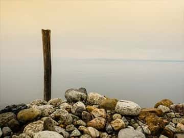
Hero
A hero image is a large image, usually between the main header and the rest of the webpage content.
It mostly covers the full width of the website, and quite often also the full height of the viewport.
A hero image may or be covered by other content, like text, links or buttons.

Title
Lorem ipsum dolor sit amet, consectetur adipiscing elit. Pellentesque tincidunt vitae nulla vel convallis. Lorem ipsum dolor sit amet, consectetur adipiscing elit. Pellentesque tincidunt vitae nulla vel convallis. Lorem ipsum dolor sit amet, consectetur adipiscing elit. Pellentesque tincidunt vitae nulla vel convallis.
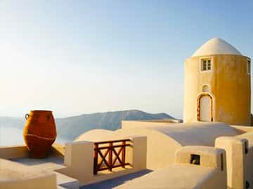
Media Panel
A media panel is a section with an image and content, like a title, text and a button.
On mobile devices, the image is placed above the content.
On desktop devices, the image and content are placed side by side.
Media Panel
Lorem ipsum dolor sit amet, consectetur adipiscing elit. Pellentesque tincidunt vitae nulla vel convallis. Vestibulum pulvinar varius sem id dignissim. Quisque quis nisi leo. Maecenas viverra libero at elit tincidunt scelerisque. Cras lacinia lobortis tellus maximus molestie. Vivamus sit amet dignissim turpis. Phasellus eu fringilla tellus, a ultrices nisl. Orci varius natoque penatibus et magnis dis parturient montes, nascetur ridiculus mus.
Button
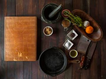
Cards
The card component is used to group various pieces of content into a container, usually an image at the top, and content, like a title, text and a button.
Card
Lorem ipsum dolor sit amet, consectetur adipiscing elit. Pellentesque tincidunt vitae nulla vel convallis. Vestibulum pulvinar varius sem id dignissim.
Card
Lorem ipsum dolor sit amet, consectetur adipiscing elit.

Card
Lorem ipsum dolor sit amet, consectetur adipiscing elit. Pellentesque tincidunt vitae nulla vel convallis.
Modal Dialog
A modal dialog displays content in a layer above all other content. Use modal dialogs to present a short-term task initiated by the user.
A basic modal dialog usually contains a title, information or controls, a primary action, and dismissal options. Keep the content brief.
Social Panel
Small
Medium
Large
All styling and components have been tested on these browsers:
Desktop:
- Edge 16 (release date: July 29, 2015)
- Firefox 53 (release date: April 19, 2017)
- Chrome 57 (release date: March 27, 2017)
- Safari 12 (release date: Sept 17, 2018)
Mobile:
- Safari on iOS 11 (release date: Sept 19, 2017)
- Android Browser (Chromium) on Android 5 (release date: Nov 4, 2014)